

Published on: 10/04/2025
This news was posted by Oregon Today News

Description
When Vancouver, Washington, adopted its first official flag in 1993, a city staff report described it as representing the city’s “emergence as a world-class city.”
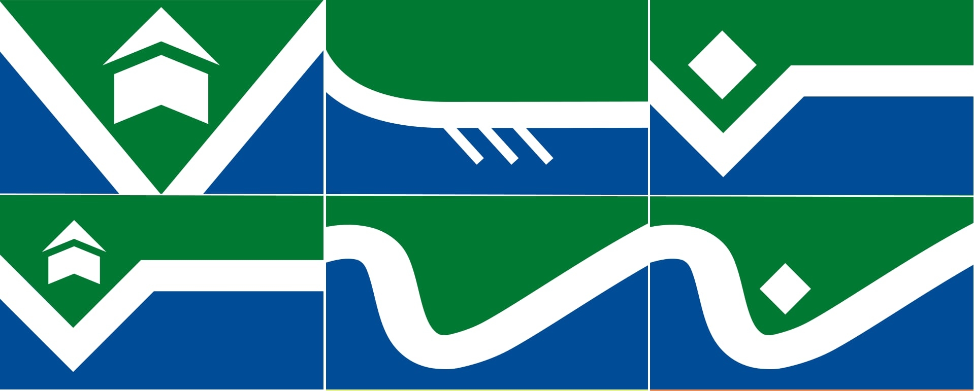
The flag shows a white bird over a river and mountains with a rising sun, with “Vancouver U.S.A.” above and a motto below.
According to Ted Kaye, a Portland-based vexillologist who has studied flags for years, the design is far from world-class.
“It’s a challenging design because it falls short of the basic purpose of flags: the fundamental purpose of a flag is signaling at a distance.

“The current flag of Vancouver is similar to many city flags where they say, ‘well, we have to write our name on the flag, otherwise people don’t know it’s our flag,’” he said. “Well, do we write the name on the United States flag or the flag of Japan or Canada? No.”
Now, Vancouver is preparing to unveil a new flag that better reflects its identity, after consulting with the North American Vexillological Association, where Kaye serves as secretary. On Saturday, Oct. 4, at 10 a.m., he will attend a city-organized ceremony where six alternate flag designs will be raised on the city hall flagpole for public viewing.
Councilmember Ty Stober, part of the city’s seven-member committee overseeing the redesign, says the project is part of a broader rebranding effort to give Vancouver a distinct identity.
“Over the years, various people have come forward asking us to come up with a new flag,” Stober said. “Vancouver is rapidly changing into a true urban city. We’re coming out from just being a suburb of Portland into a city [in] our own right, and so it feels like now is the right time to be creating symbols that truly define who we are.”

‘Good’ flags, ‘bad’ flags
Earlier this year, the committee reviewed 138 public submissions using “‘Good’ Flag, ‘Bad’ Flag,” a book Kaye compiled two decades ago. They selected six finalists in September and are seeking public feedback until Oct. 10.
That guide outlines five principles of good flag design: simplicity, meaningful symbolism, two to three colors, no lettering or seals, and distinctiveness.
Is it time to change up the Oregon state flag?
Kaye has served as a flag design consultant for about 200 municipalities and states across North America. By those standards, Kaye says Vancouver’s current flag — with its phrases “Vancouver, U.S.A.” and “a colorful past, a bright future” — is “very disappointing.”
“If you write the name on your flag, then your symbolism has failed,” he said. “Vancouver’s flag has white, yellow, green, blue and black … it has lettering on the flag, it’s quite complex. We like to say, ‘a flag should be so simple that a child can draw from memory.’”
He also criticizes its symbols — a sun, mountain, river and bird — for being indistinguishable from other cities’ flags.

By contrast, he praises the six finalists, which all use dark green, dark blue and white.
“There’s symbolism of forests, rivers, fort, the geography of the river in Vancouver and, in one case, a canoe,” he said. “There’s just three colors, and the three colors are meaningful.”
Kaye says most municipal flags in the Portland metro area and Southwest Washington — including Troutdale, Gresham, Lake Oswego, Wood Village, West Linn, Battle Ground, Camas and Ridgefield — are poorly designed.
But there are still a few good designs, he says — Portland, Silverton, Albany and Salem, the last of which he helped redesign before its 2022 adoption to symbolize a popular springtime scene in the state capitol park.
“The big cherry blossom with an implied star, meaning we’re in the state capitol,” he said. “And the blue stripe at the hoist, representing the Willamette River. That’s a world-class flag.”

New flag sparks civic engagement
Back in Vancouver, Stober says community enthusiasm for the new flag is strong, as shown by the high number of submissions and online poll participation.
“The average resident of Vancouver just really doesn’t even think or even know that we even had a current [flag] design,” he said. “Now we have our community really engaged and interested in what we’re doing, and so I think there will be a lot more ownership to a flag going forward than what there ever has been in the past.”
Stober adds that the committee may adjust the winning design if public feedback or expert input suggests changes are needed to ensure the flag works visually when flown. The committee is expected to choose a final design by the end of October, with the city council adopting it by resolution in November.
For this Portland vexillologist, every day is Flag Day
Regardless of the outcome, Kaye says any of the six finalists would elevate Vancouver’s image, and he commends the city’s leadership for pursuing the effort despite potential criticism.
“Some people might say, ‘You’re canceling our history by changing the flag.’ Other people might say, ‘Don’t you have something better to do? You should be fixing the potholes.’ And other people might say, ‘Why are you wasting our money on this project?’
“The answer is: Having a great city flag is worthwhile, both externally showing Vancouver to the rest of the world, and internally creating a symbol of Vancouver that can help with civic cohesion in the city,” he said.
News Source : https://www.opb.org/article/2025/10/04/vancouver-new-flag-designs-washington-ted-kaye-vexillology/
Other Related News
10/04/2025
A state board dropped nearly 100 derogatory terms from maps this year Central Oregons Chin...
10/04/2025
Photographer KB Dixon continues his series of cultural profiles with portraits of best-sel...
10/04/2025
The Trump administration is pointing to renewed unrest in Chicago and Portland Oregon to j...

10/04/2025
Whether youre heading out to the Portland Greek Festival or getting your garden in shape f...
10/04/2025
Multnomah County District Attorney Nathan Vasquez worries that President Donald Trumps sta...
Follow

Download Our App


Copyright 2022 © EPUERTO. All Rights Reserved